Understanding fitting results
Topics to cover
- Description of fitting output
- What if parameters do not move from the initial values (solver issues, flat data)
- What best-fit and confidence intervals mean
- What correlation plots mean
- What are signs of overparametrization (too many fitting parameters)
- What hypothesis testing tells you and what does NOT.
What if my run never finishes?
- This happens if there is a parameter that is not supported by the data and you are using 'simplex' algorithm for fit-only or trying to do 'fit_with_error_analysis'. The simplex (Nielder-Mead) algorithm is a default algorithm for Monte-Carlo runs. The problem is that it does not honor the parameter boundaries. Therefore, it may run into a region of the parameter space with unreasonable values of this 'unsupported' parameter and never finds a suitable minimum. Solution: fix this parameter (do not vary in the fit).
What if the parameter hits a limit in a 'fit-only' run (using an algorithm that honors the limits: GlobalSearch, MultiStart, or DirectSearch).
- This means there the algorithm finds better sum-of-squares at the boundary and wants to go beyond it to further reduce sum of squares. If the parameter value is still in a meaningful range, you should simply increase the limit. However, if the value is already unreasonable (unphysically large or low) this means the dataset does not contain information to support determination of its value. In this situation you should fix this parameter at some plausible guess. For example, in the line shape fitting we are not sensitive to Koff>3000. I set a limit at 5000 and see the 'fit-only' run with a 'DirectSearch' algorithm hit this limit.
Then I make this parameter fixed and set it to 3000/s. The quality of fit does not suffer more than a couple of percent increase of sum of squares. You will report the result explaining that the data do not allow determination of this parameter and it was fixed at a plausible range. What you can do additionally - fix it at different values and see how the data is fit. This way you obtain a sense of sensitivity of the the fitting result to the value of this parameter and can derive a range of values that provide better fit---this is your "plausible value range" to report.
What if I see some parameters extremely tightly correlated in Monte-Carlo?
- It means they always vary together or variation in one parameter is always compensated by a corresponding change in another one (resulting in the fit of similar quality). This is a classic signature of overparametrization of the model: the equations contain more parameters than data can support.
- An easy scenario:
when this is correlation makes them equal, such as Scale Factors of different line shape profiles from the same HSQC:
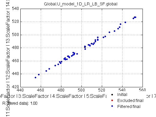
Solution in this situation is to simply link them between the series and fit just one ScaleFactor value.
- If ratio is different or they are inversely correlated---you got a scientific problem.This means your datasets do not support determination of these parameters independently of each other. The model equations have to be modified to directly introduce this correlation.
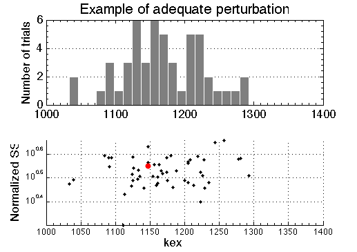
A sum of squares of the best-fit to the experimental data larger than any of fits to the simulated Monte-Carlo ensemble
Random perturbation (Monte Carlo, MC) of simulated data is intended to simulate variability in real data. Fitting of these MC datasets produces model parameters that correspond to differently perturbed data. Their best-fit values from multiple MC runs are represented as histograms (below, top panel). The bottom panel on the graph shows actual value of sum of squares for all of the runs included in the histogram (shown as black dots). The sum of squares of the best fit to the original experimental data is shown as a red dot. If we correctly take into account all sources of uncertainty in the experimental data and the perturbation we apply to the simulate "noisy" data is adequate---the red dot will reside inside a cloud of black dots.
However, if sum of squares of best fit to the experimental data is larger than SS of MC sets---red dot is well above black dots---this is an indication that (1) model curve does not go through the data, and (2) perturbation used to produce "noisy" datasets for Monte-Carlo analysis is inadequate by being too small or not taking into account some significant source of uncertainty. This results in ensemble of simulated datasets in the Monte-Carlo analysis being a poor mimic of experimental data. In this case uncertainties of best-fit parameters determined from the MC ensemble are meaningless!
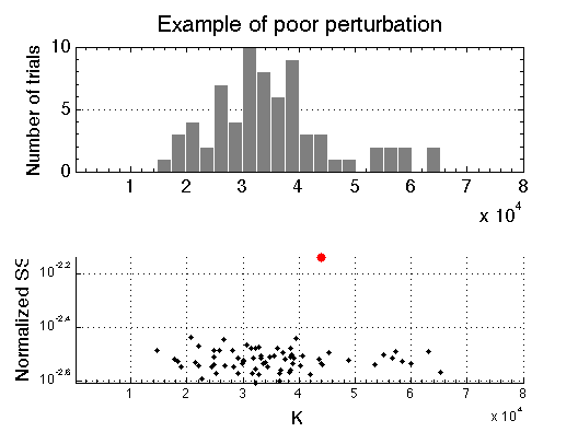
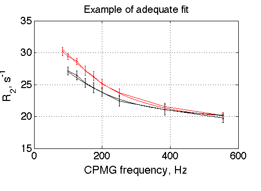
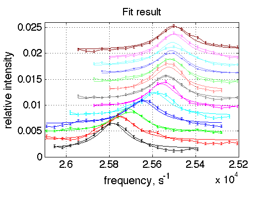
The reason for the case above is that the curves do not go through the data quite well due to large noise (distortions) in experimental data (graph below). The error bars shown on experimental curves were derived from some instrumental measurement of noise. Obviously, these data contain additional unaccounted source of experimental error or the instrumental error measurement is underestimation.
For comparison, the example of the fit that adequately goes through the data is shown below. This fitting session that produced the very first graph in the beginning of this section, where best-fit SS (red dot) is well within the simulated "noisy" MC ensemble (black dots).